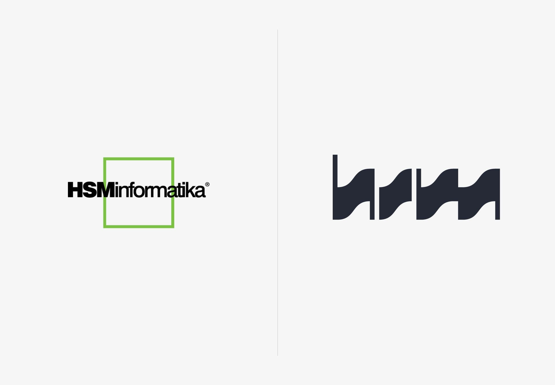
Windows 95 might still be faultless when it comes to function, but if you cast your gaze on the branding from that same year... there’s room for improvement. If a brand’s business is forward-thinking, but the visual identity is stuck in the past, the present is the perfect time to give it a refresh.
BRAND F5
HSM is a family-owned IT company and the top player in the region with over 30 years of dedicated experience in implementing digital business solutions. HSM takes things seriously by not only introducing new hardware and software, but also helping their clients improve and modernize their business through their ingenuity. Now, it was our turn to do the same for them. The goal of the new branding is to introduce a modernized company, quality service, and that human element of motivated, dedicated employees that keeps the whole wheel spinning.

IMPULSIVE DECISION
Some brand elements were advanced in the rebranding, and some were reduced – for example, the name HSM informatika was shortened to their signature acronym HSM which represents the core brand value – Human sense moves technology and business. This slogan is also a small nod to the human element which drives the entire company, as well as the technology and business of the clients. This aspect is most noticeable in the fact that HSM isn’t simply a distributor of equipment and programs (as they had portrayed themselves until now), but also an experienced, approachable consultant whose valuable insights help improve others’ business.

Digital solutions are the starting impulse for the wave that drives a business forward, so the core element of the new visual identity became exactly that - the impulse. Not only does HSM initiate and drive change, but also combines the analog impulses created by humans with the digital impulses created by a device, to get the complete picture when it comes to HSM’s approach to technology and business.


The effect of the impulse as the main form of the brand is visible in the logotype, the typeface of the title that follows the waves of the impulse, and the linear pattern used across various materials. You’ll likely notice the clear impact of the human element, as the driving force behind the creation of the new visual identity which you can find in the continuation of this project case.


TRIPLE IDENTITY
For a brand that communicates with a wider audience in one moment, and easily transitions to speaking to specialized digital experts in the next, it is useful to have a diverse visual presence that follows the pace of the communication. That’s why, from now on, HSM can choose among three different themes (light, dark and color) to present their services to various clients in a clear way, suitable for their preference.


Credits
Señor
Vanja Blumenšajn ~ Very creative director, copywriter | Jurica Ćorluka ~ Head of creative, copywriter | Vanja Luetić ~ Senior copywriter | Lucija Drača ~ Junior copywriter | Tomislav Fabijanić ~ Head of design | Mišel Kovačić ~ Designer | Iva Kaligarić ~ Strategy director | Irena Golubiček ~ Branding specialist | Danijela Maričević ~ Head of account | Ana Ključević ~ Account manager
HSM
Jelena Jelinić ~ Director of human resources and marketing | Ana Šutić Renić ~ Acting marketing director


