The early 2000's saw a big rise in the number of shopping malls. They were popping all over Zagreb, especially in the western part of the city. After the expansion, came a period of consolidation – the merging of the successful ones and the gradual disappearance of those that didn’t manage to draw a sufficient number of customers.
FAR FROM THE CENTER OF ATTENTION
Right from the start Point was a specific shopping mall – versatile and multifunctional but secluded and primarily orientated toward the neighborhood of Vrbani. Low awareness, lack of knowledge about the mall’s location and its offer, as well as strong competition from the nearby City Center One in Jankomir resulted in less visitors and a lower number of leaseholders.
“I feel that Point is out of my way, it’s pretty complicated to reach if you’re not specifically going there.” — Mirjana, 55, Rudeš
“It’s not the type of mall we’re used to. It’s not as big as City or Arena.” — Marko, 25, Jarun
THINK GLOBALLY, POSITION YOURSELF LOCALLY
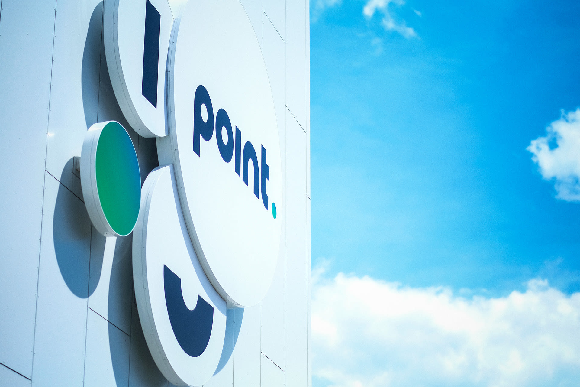
Faced with strong competition from big established shopping malls (CCO, Arena and Westgate), we decided to position Point as a local square – a space and a place for everyday meetups and smaller, more frequent shopping runs. By doing so, we utilized two of its biggest comparative advantages – the vicinity to potential consumers and the wide array of stores which makes it possible for people to get a lot of things done at one place.
WE PUT POINT ON THE MAP
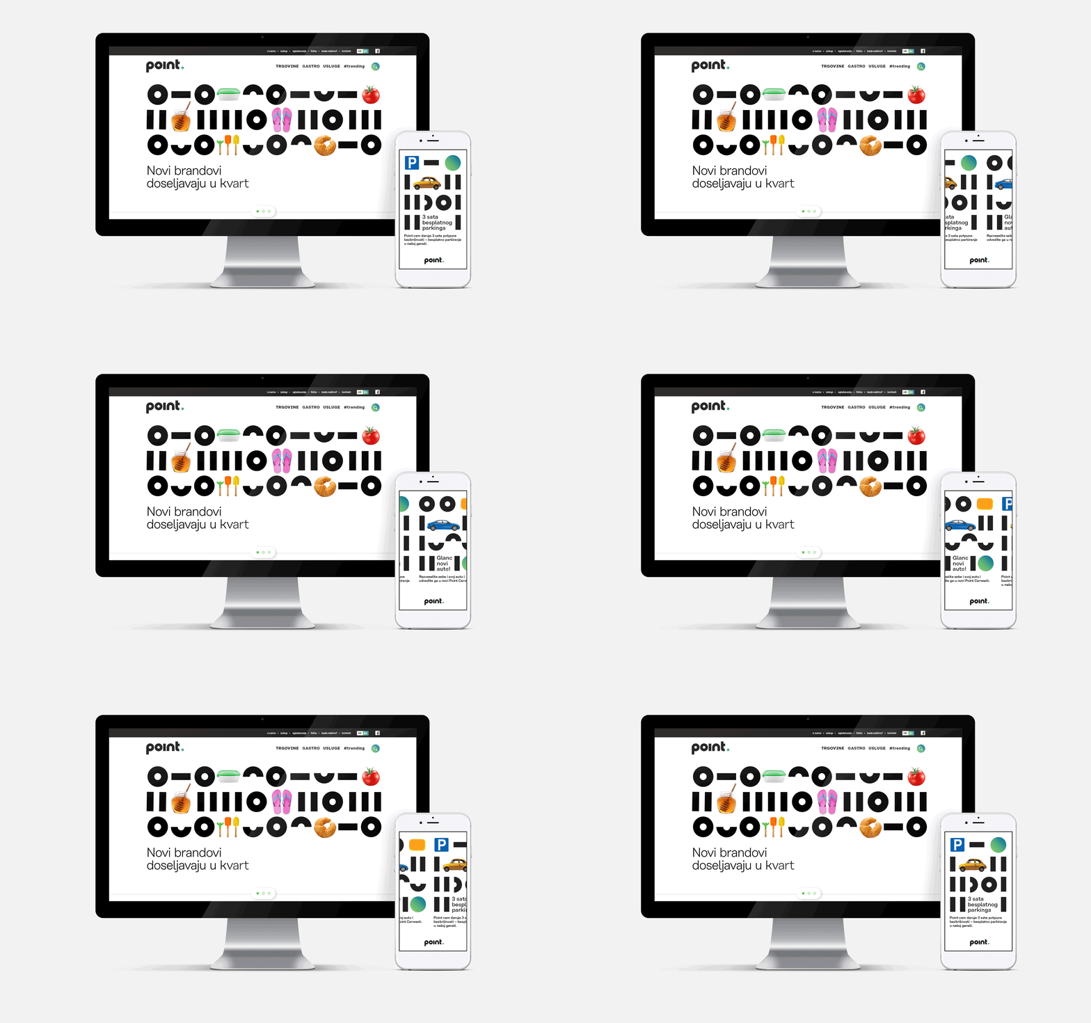
The main goal of the rebranding and the campaign was to remind people of the location and let them know that, whether they want to do some serious shopping, have coffee with friends, pop into the post office or just go out for dinner, they can do it all – right here!


 Where can I find gadgets and cosmetics?
Where do I do my hair and my grocery shopping? Right here!

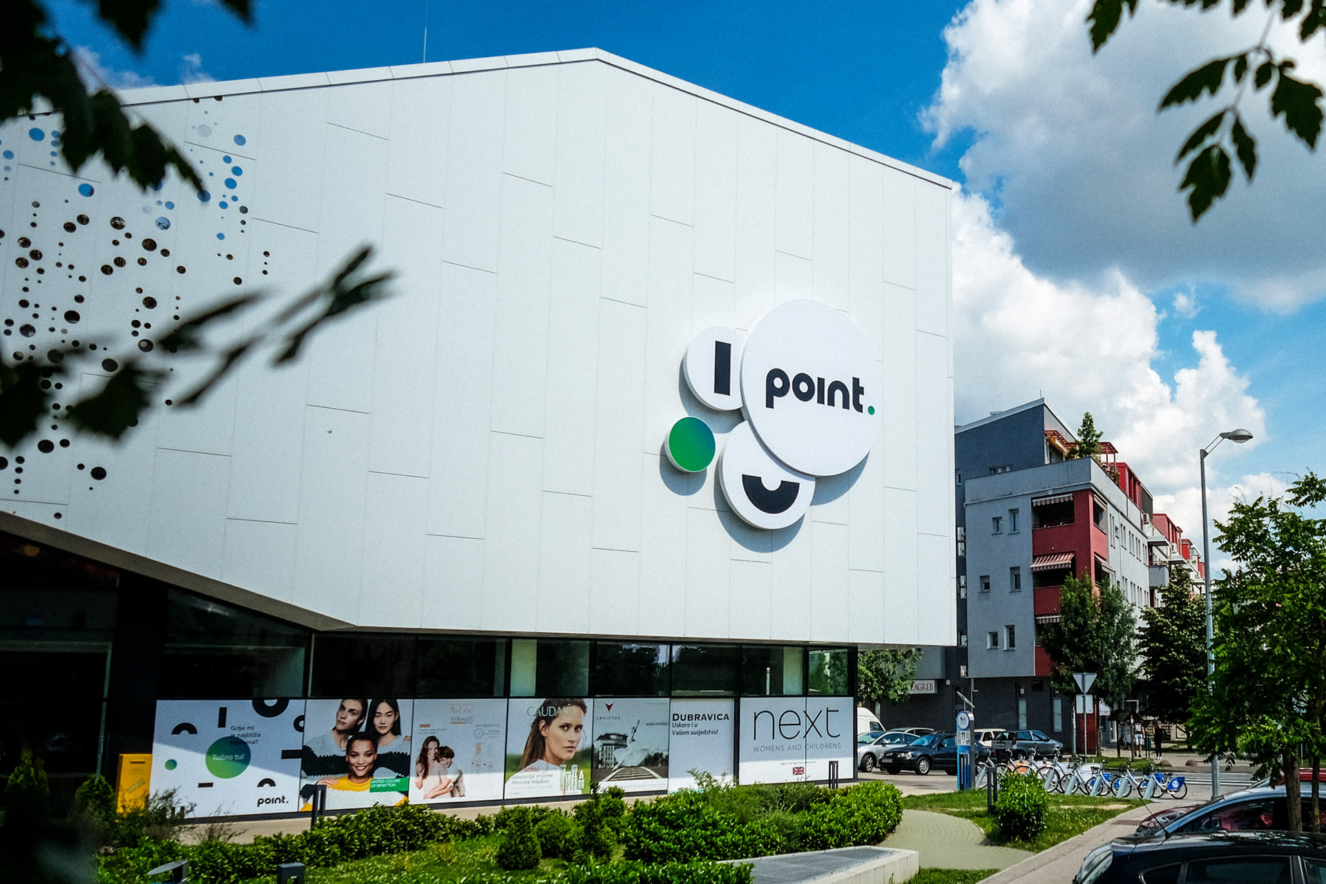
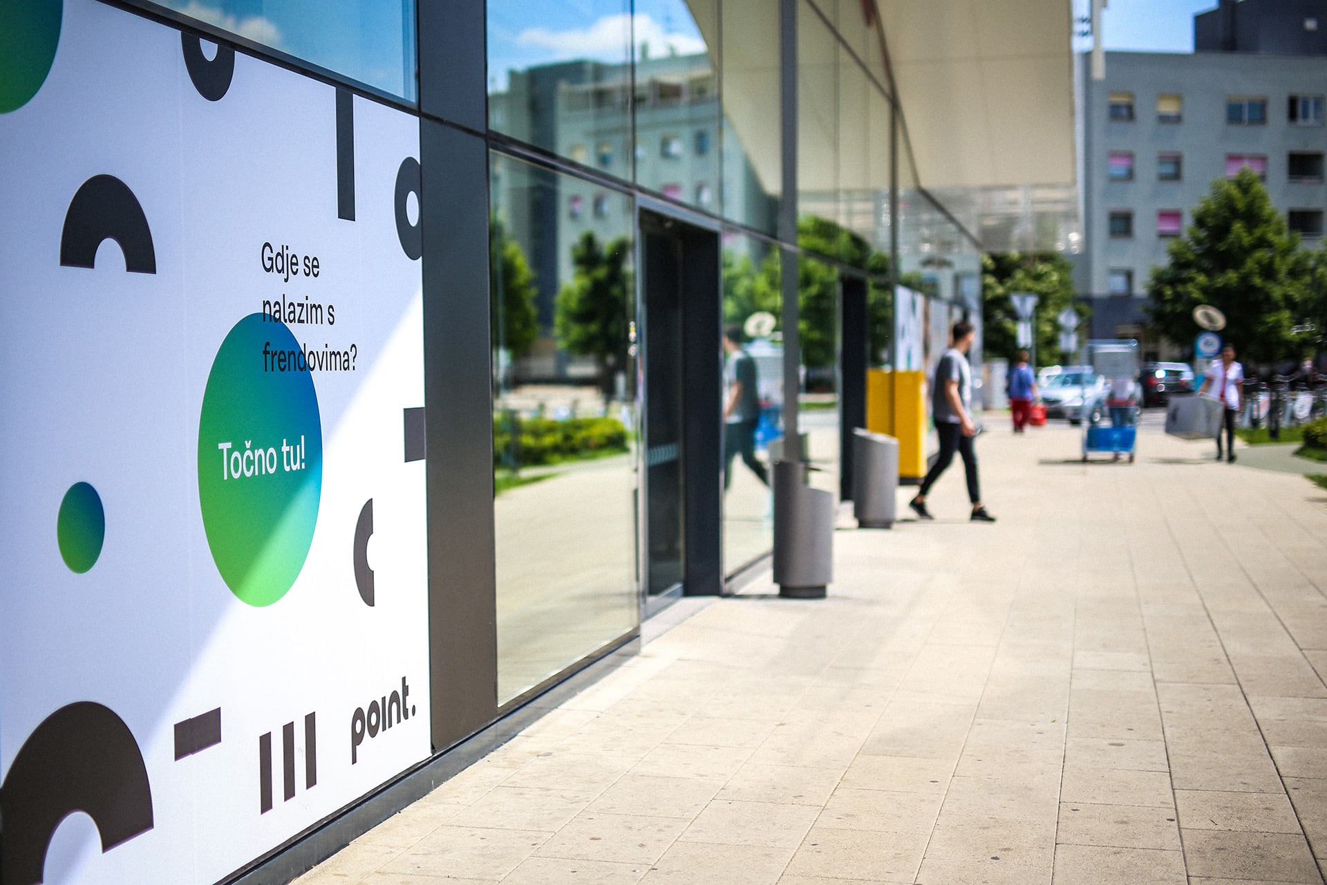 Where can I rendezvous with my friends? Right here!
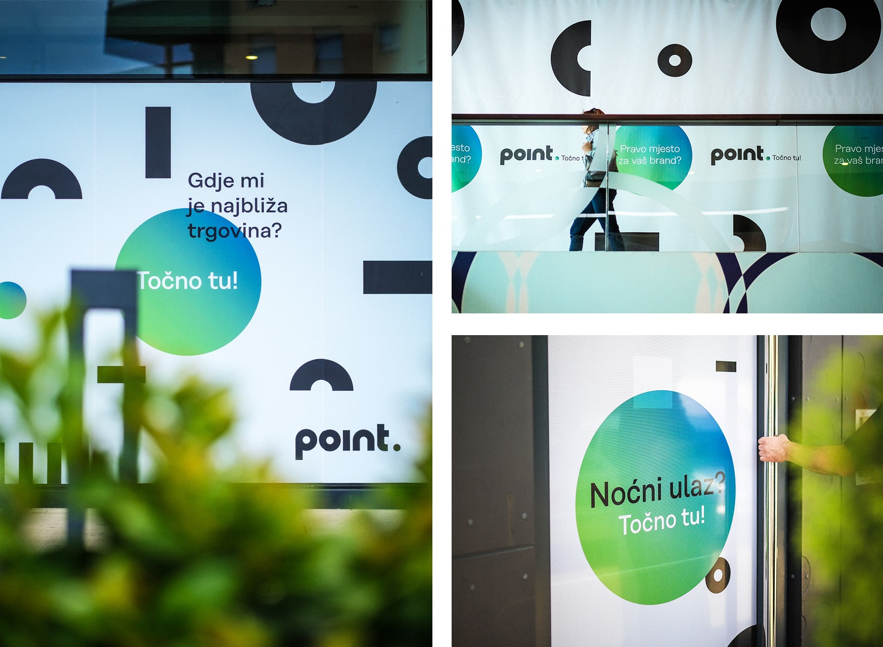 Where is the closest store? Right here!
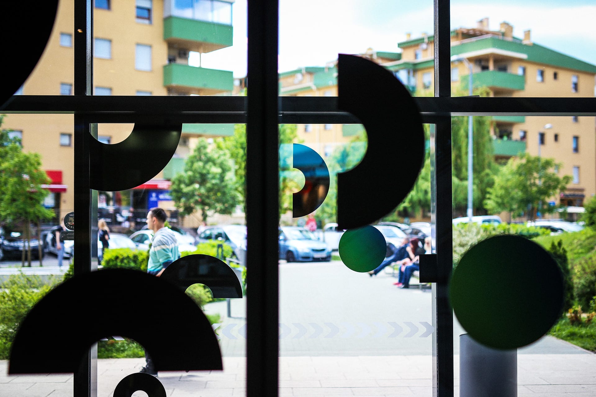
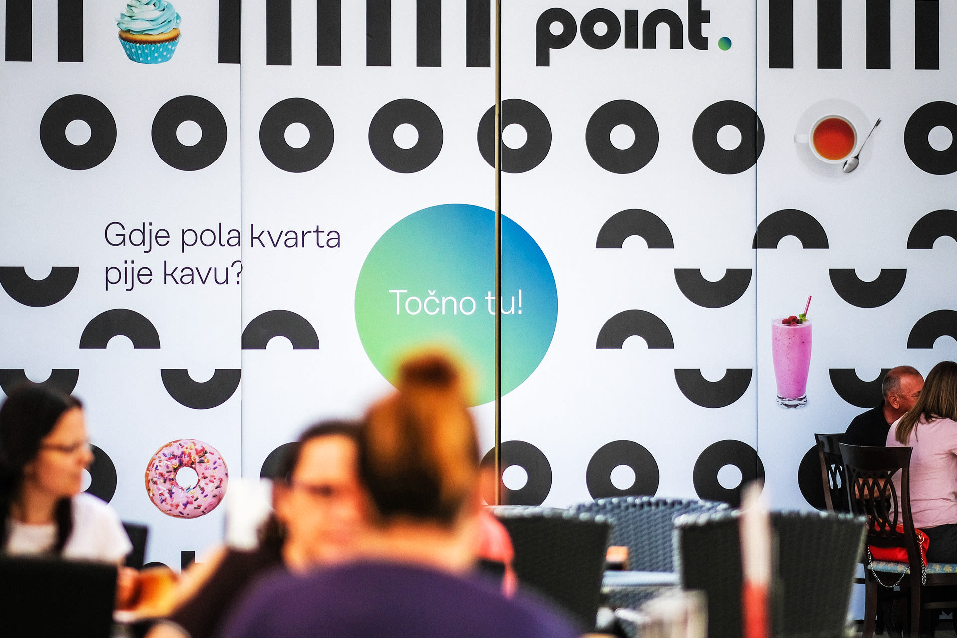 Where does the neighbourhood drink coffee? Right here!
Point well taken
Just a few months after the rebranding, the client called in to happily announce that the initial goal was accomplished - all the vacant retail space was leased out and contracts with new tenants have been successfully signed. This news was welcomed with great enthusiasm not only by us and the owners of Point shopping mall, but also by the ever-growing number of visitors who now enjoy a better selection of stores.
Credits
Señor
Vanja Blumenšajn ~ Very Creative Director | Luka Pervan ~ Creative Director, Copywriter | Damir Mazinjanin ~ Art Director | Nikolina Steković ~ Designer | Irena Lešković ~ Project Lead | Iva Kaligarić ~ Strategic Director
Associates
Andrej Filetin ~ Creative Director (Filburg) | Mila Marina Burger ~ Business Development Director (Filburg)
Point
Dino Švedek ~ Marketing Manager
