Consumers want quality ingredients, without any additives they deem unnecessary and unhealthy. Why not emulate the principle of simplification, the same principle the food industry applies, when it comes to branding and design? It would seem that less in this case is definitely – more!
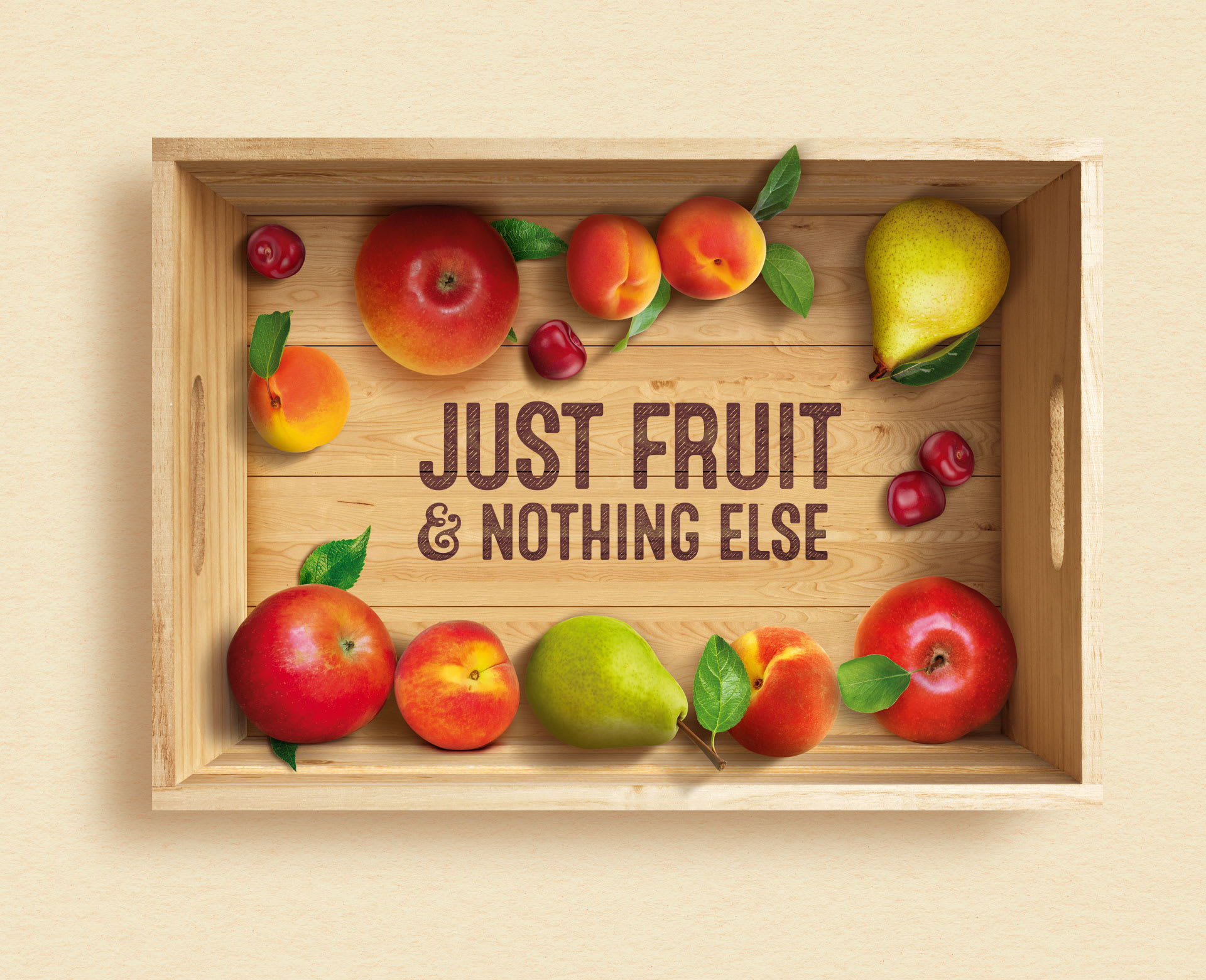
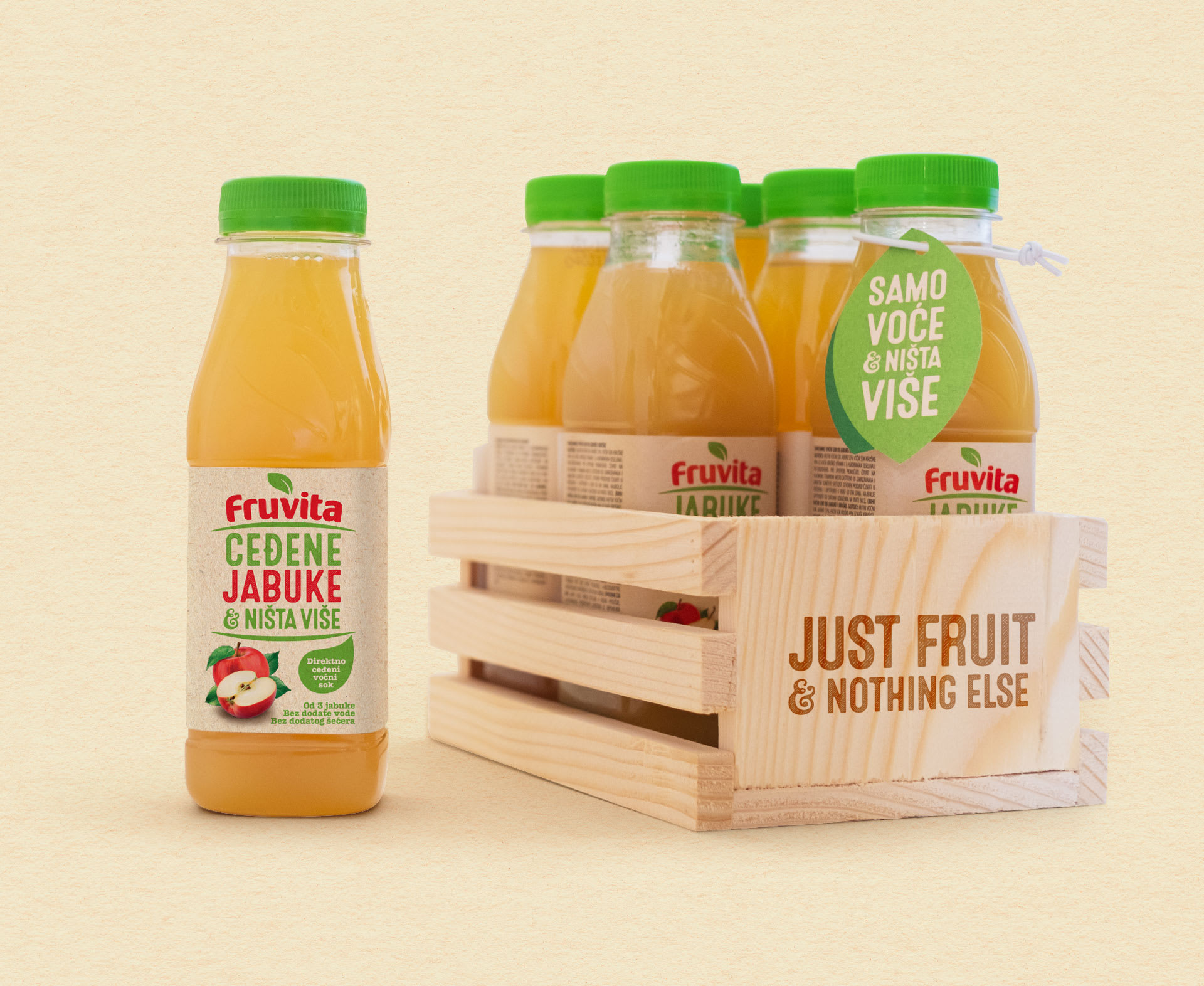
JUST FRUIT AND NOTHING ELSE
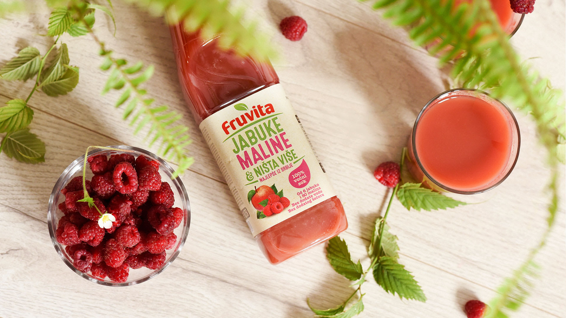
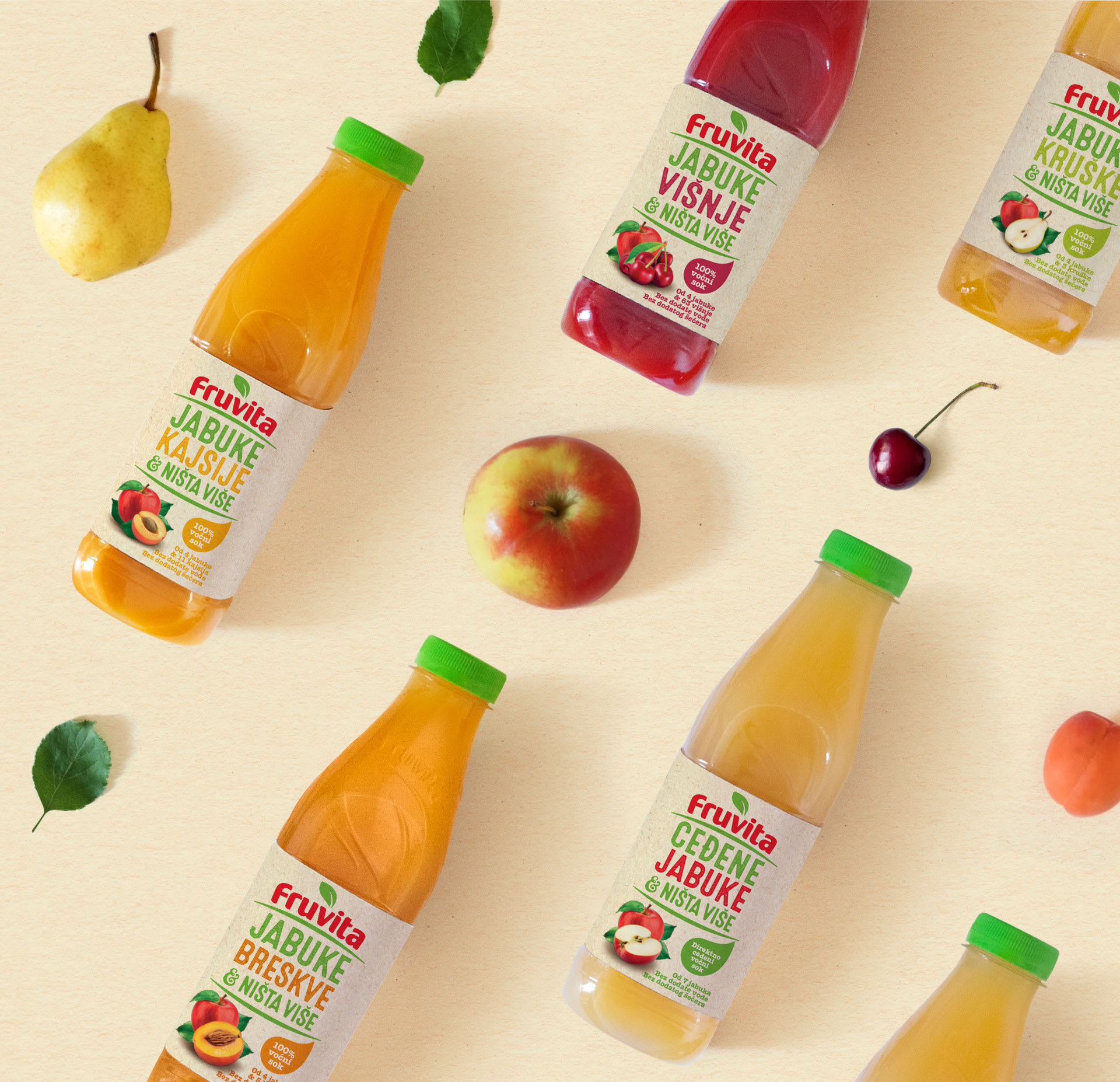
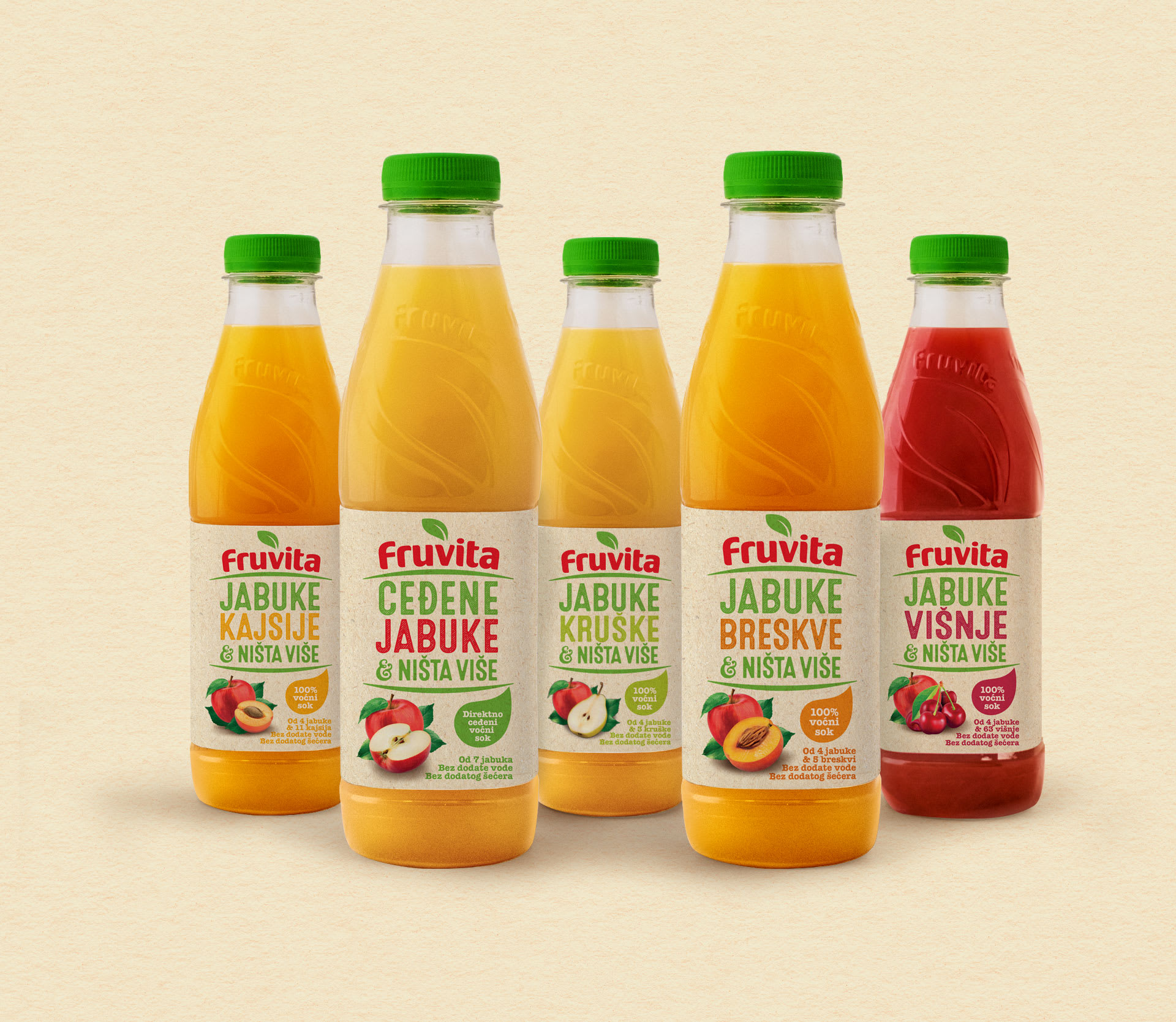
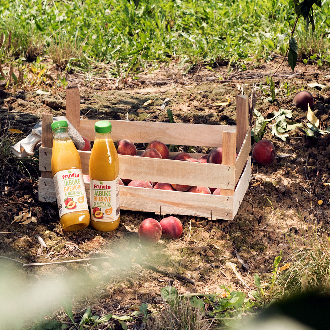
The headline you’ve just read is the philosophy behind Fruvita, the biggest Serbian brand of natural juices. It’s also the complete list of ingredients. There’s no added water, sugar or additives – each bottle contains just fruit and nothing else. This is what makes Fruvita stand out in a category that often uses deceptive and evasive terms to conceal the true contents of the product. Since we’ve got nothing to hide, we decided to be honest and highlight the juice contents on the packaging as much as possible.
SOMETIMES MORE IS MORE
While describing the flavors in its assortment, the competition always uses singular nouns, as if their juice was made out of a single peach. Due to the large amount of fruits in every Fruvita, we introduced a small but significant change – we use plural while listing the fruit a juice is made of. What would you rather drink, an apple juice or apples juice?
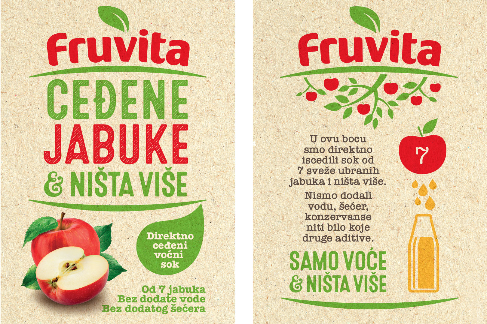
This principle of naming ensures the preservation of the brand’s recognizability even when introducing new flavours, so the costumer can rest assured that the bottle contains only fruit and nothing else.
Credits
Señor
Vanja Blumenšajn ~ Very Creative Director | Jurica Ćorluka ~ Creative Director, Copywriter | Vinko Čuljak ~ Art Director | Iva Kaligarić ~ Strategic Director | Irena Lešković ~ Project Lead
Fruvita
Goran Redžić ~ Director | Nataša Šarčević ~ Marketing and Business development Director | Jelena Jevtić ~ Brand Coordinator
