Building an identity is not an easy task. You need research, drawing, designing and...of course, a bit of inspiration. Although we're talking about two very different industries, it seems that our phases of work are very similar.
IDENTITY THAT FITS
The new company will deal with the construction of residential and non-residential buildings, engineering and construction consulting, professional supervision, project management and maintenanceas well as the sale and rental of real estate. In short, everything related to squares - from conception and execution all the way to sales, rental and maintenance. And when we add the third spatial dimension to the square, what we get is – a cube.
- cubature (from: cubus), in mathematics, the volume of a limited part of space; in general, it is solved by applying an integral calculus. - Cuba Gooding Jr. for enciklopedia.hr
BUILDING A CASE FROM SQUARE ONE
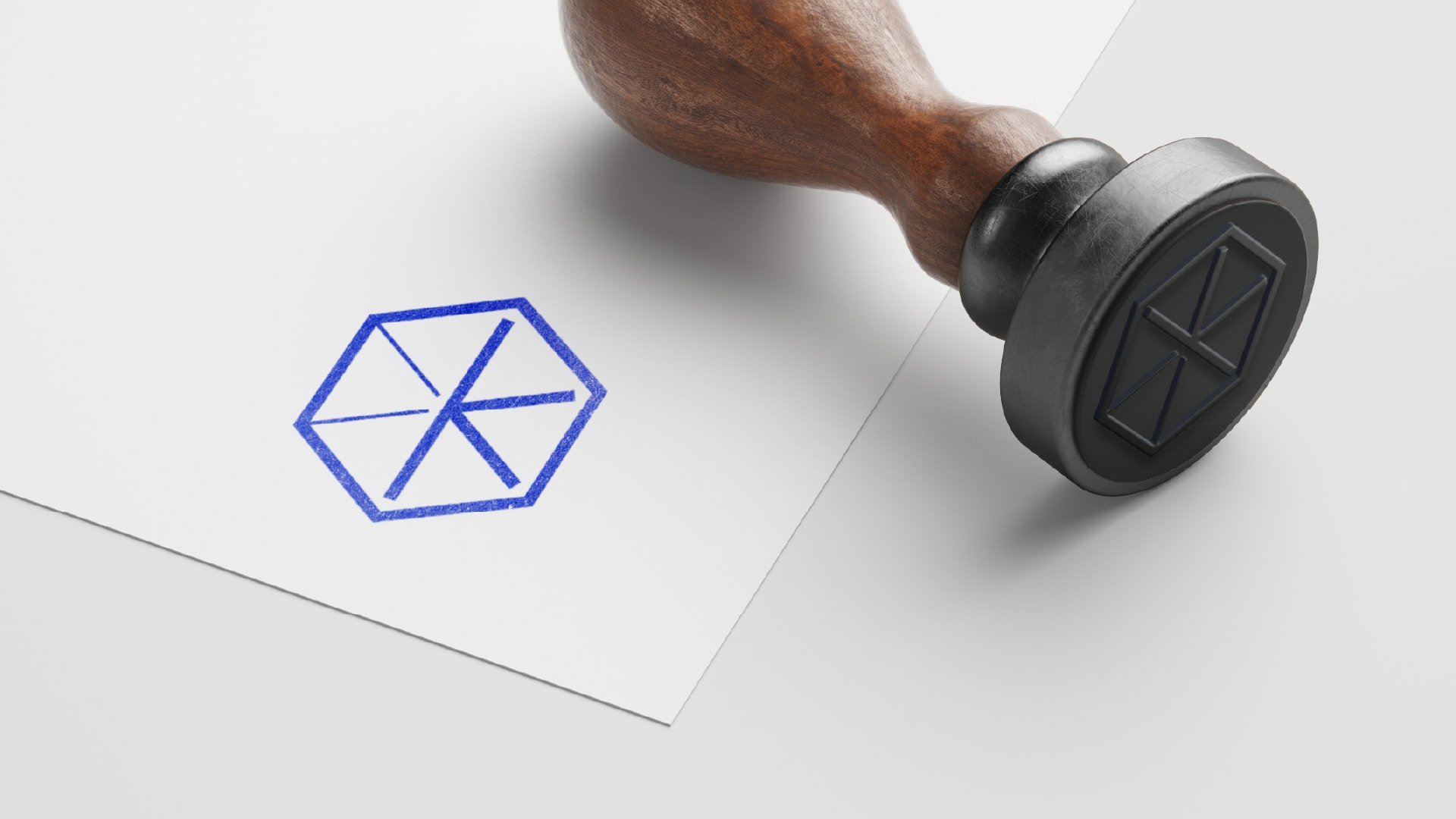
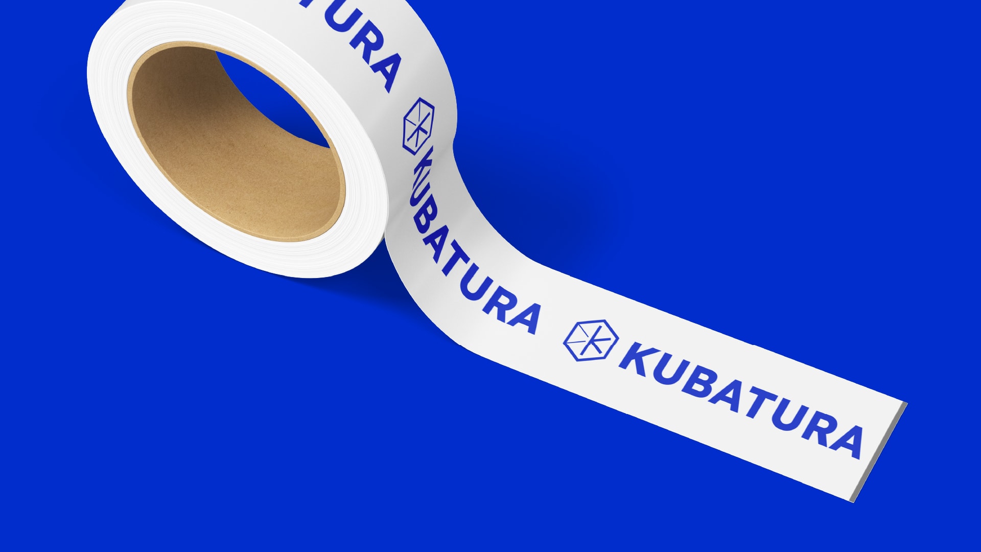
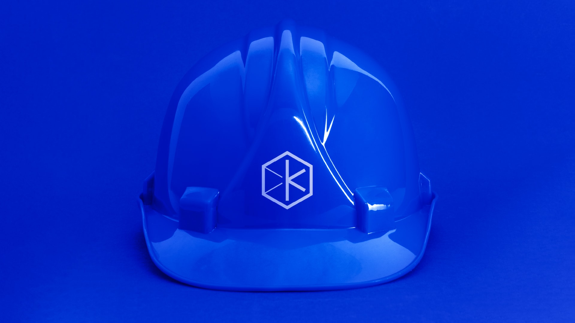
The initial letter and the meaning of the name Kubatura served as an inspiration for the logo. The arms of the letter K created height, width and length - the axes that, when closed, form a cube and a sign. This laid the foundation for the rest of the identity.

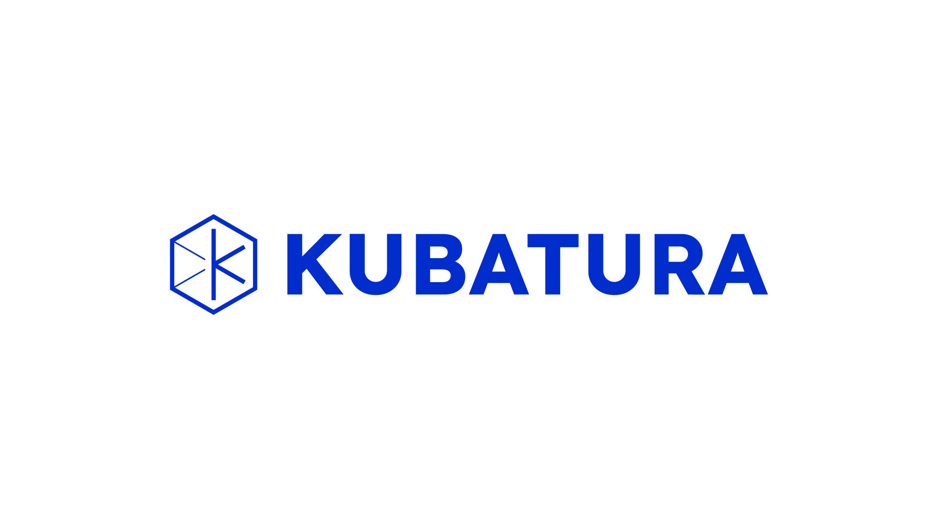
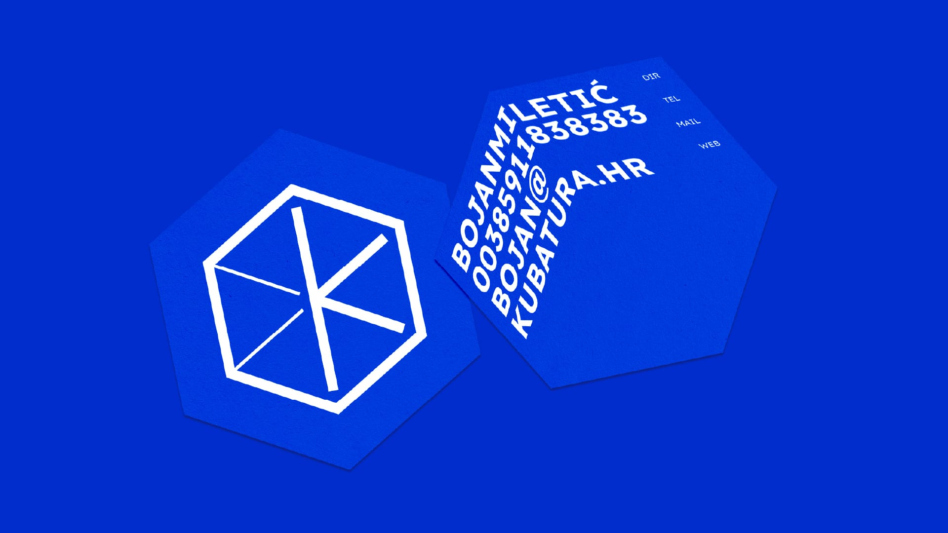
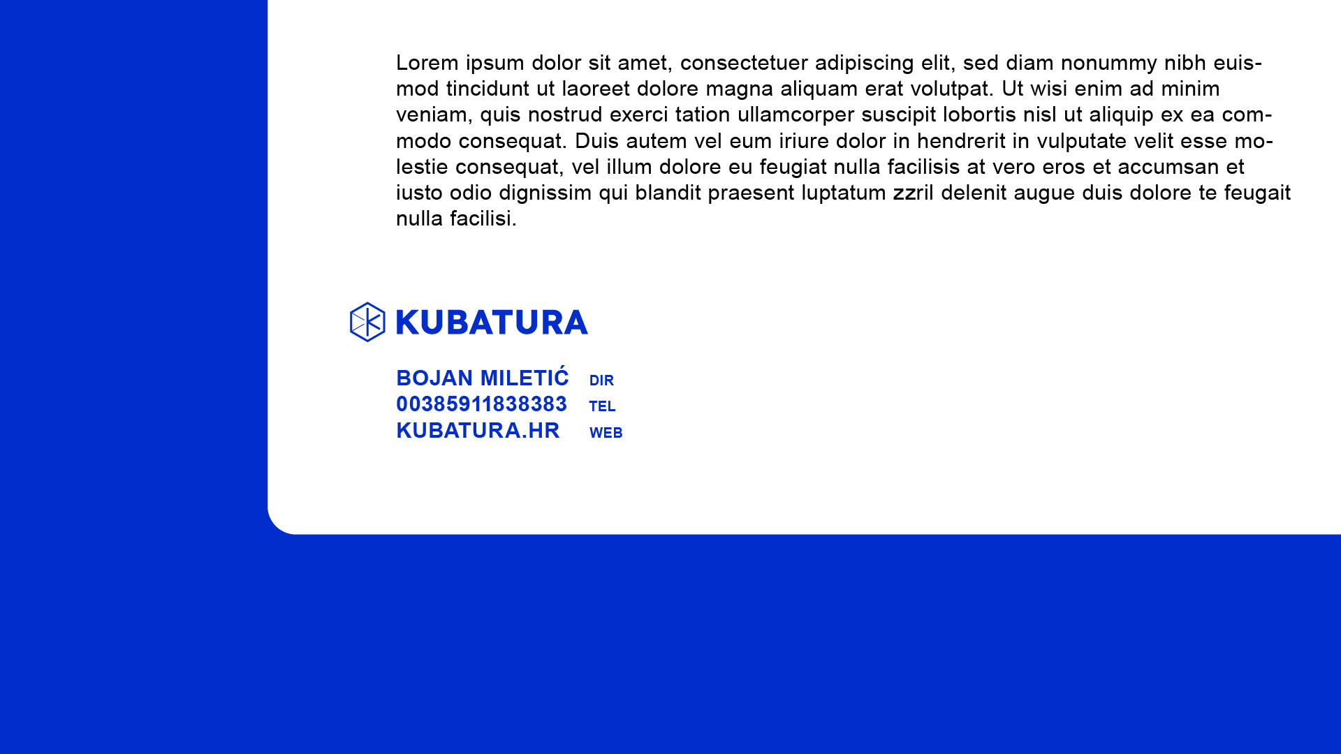
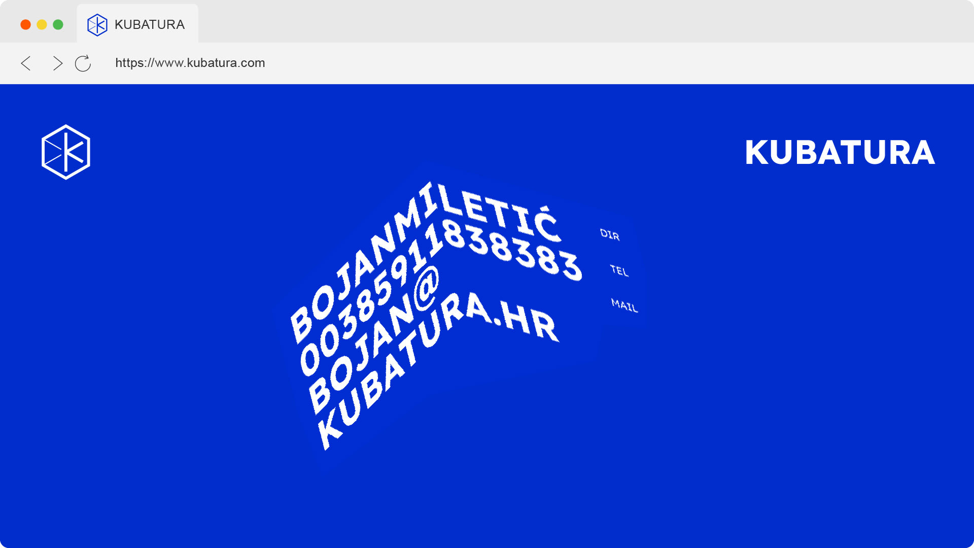
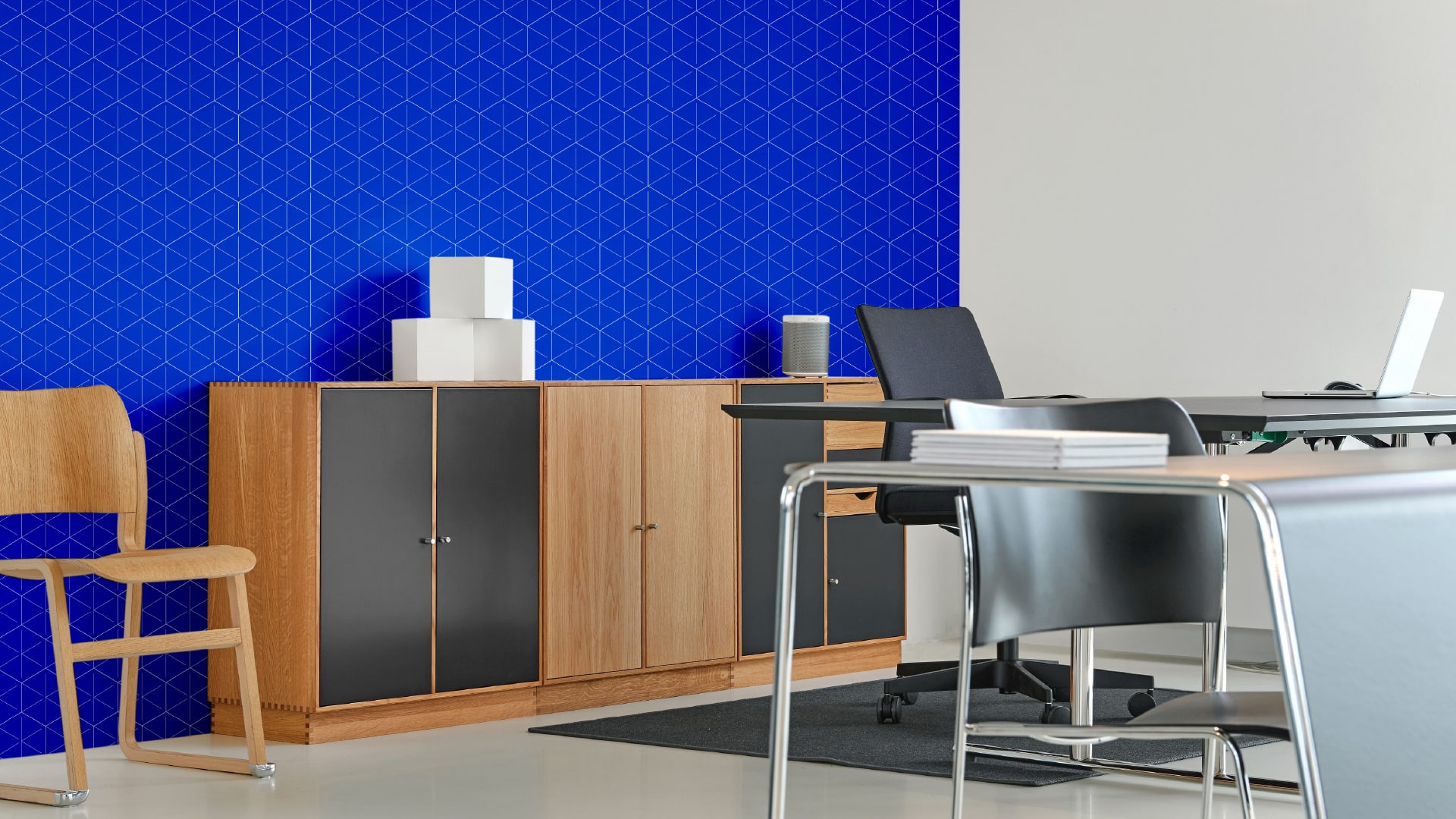
The same 2D/3D illusion is used in other materials (business cards, landing page). The grid created by the construction of the cube is an interesting and polyvalent graphic element that makes the brand identity tailor-made: minimalist, "techno" and modern.
Credits
Señor
Vanja Blumenšajn ~ Very Creative Director | Tomislav Fabijanić ~ Head of Design
Kubatura
Boris Miletić ~ Director
