Painting a home or office space is an important life event. But it can also be very stressful. That’s also contributed by sloppy handymen who have tarnished the reputation of the profession and created mistrust. So how to brand a small painting company that doesn’t fool its clients?
“MASTERS” OF THE CRAFT
At the mere mention of the word handyman, there are numerous negative associations that usually appear. Delays, cursing, messing around, unreliability, inconvenience, untidiness… Unfortunately, that isn’t a stereotype, but a reality that many faced at least once.
In the saturated market, those businesses advertise themselves through word-of-mouth, leaflets at tram stations and buildings, and on websites that could use a refresh. However, due to the tarnished reputation of the industry, people are less inclined to hire someone who will half-ass their work. And that’s why they’re prone to doing the work themselves.
THE NEW BRANDING IS DRIPPING
Plava panda (meaning: Blue panda) is a brand that represents the values of its owner. So it paints houses and office spaces in an educated, meticulous, pleasant, positive and responsible manner — which is a real rarity among odd-jobbers. After combining those assets with the panda motif, the most common symbol of endangered animal species, we created the slogan — An endangered species among handymen.
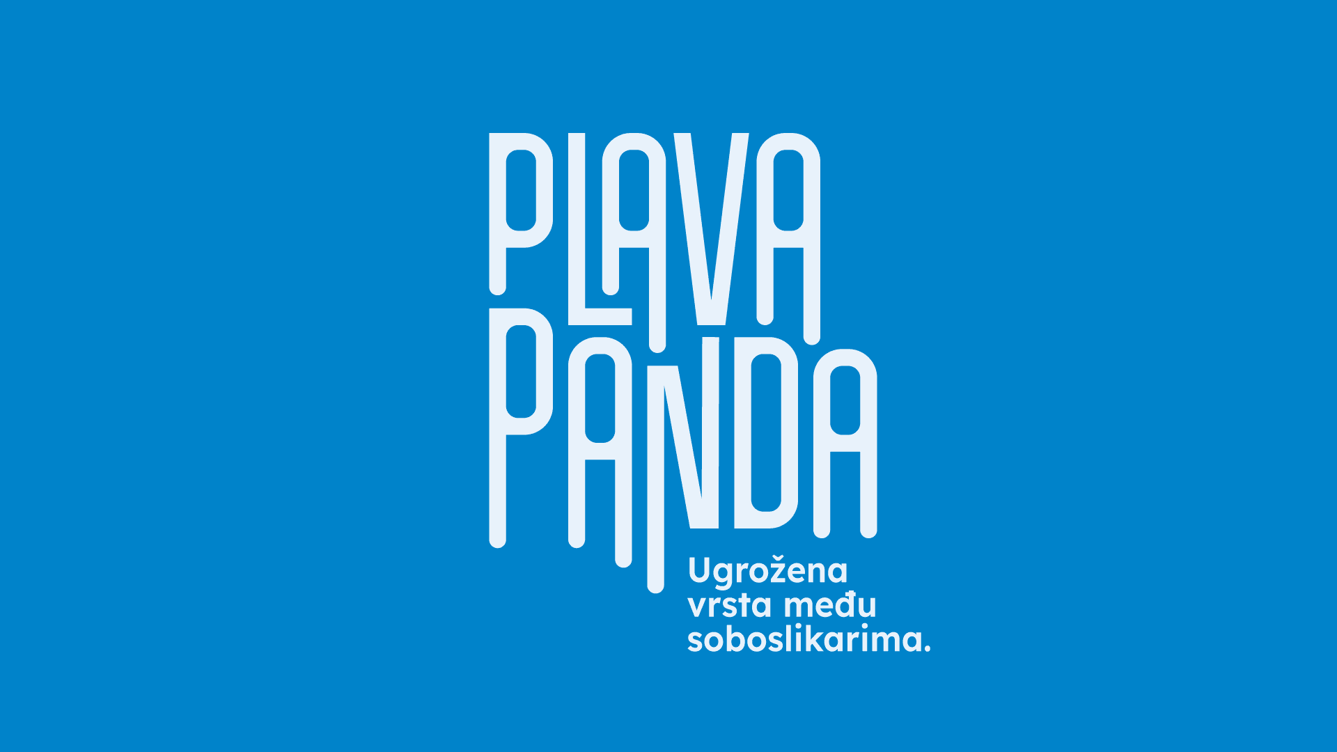 Blue panda. An endangered species among handymen.
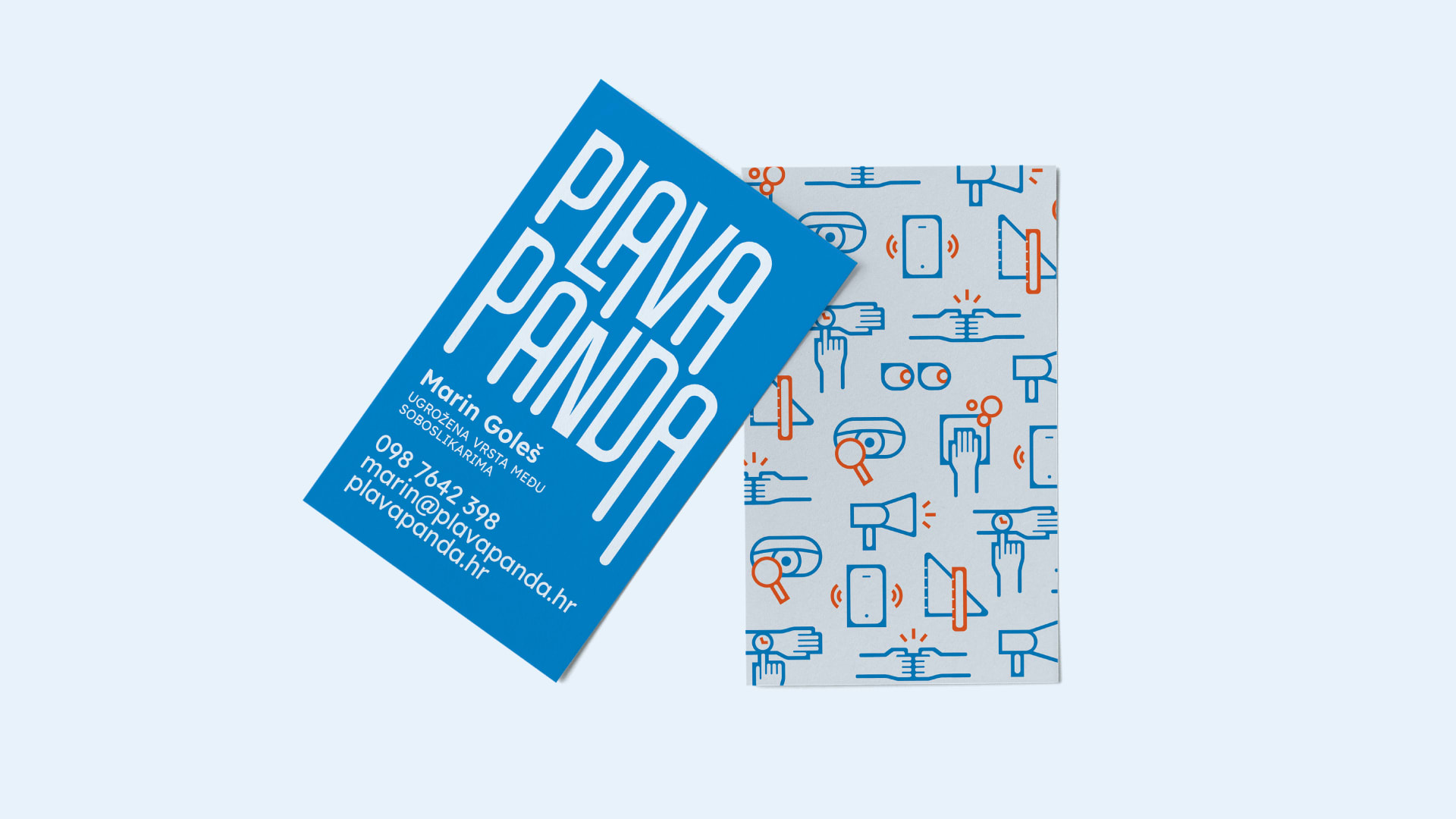
A subtle drip at the end of the letters serves as a key element of visual communication. The rounded negative space gives the logo warmth, humanity and relaxedness. The harmonious, balanced and clear typography communicates meticulousness and neatness in the work.
The warm shade of blue as the primary color further emphasizes the unusual name of the business. The complimentary orange, which was chosen as an accent, adds to the activity, dynamism and liveliness of the identity.
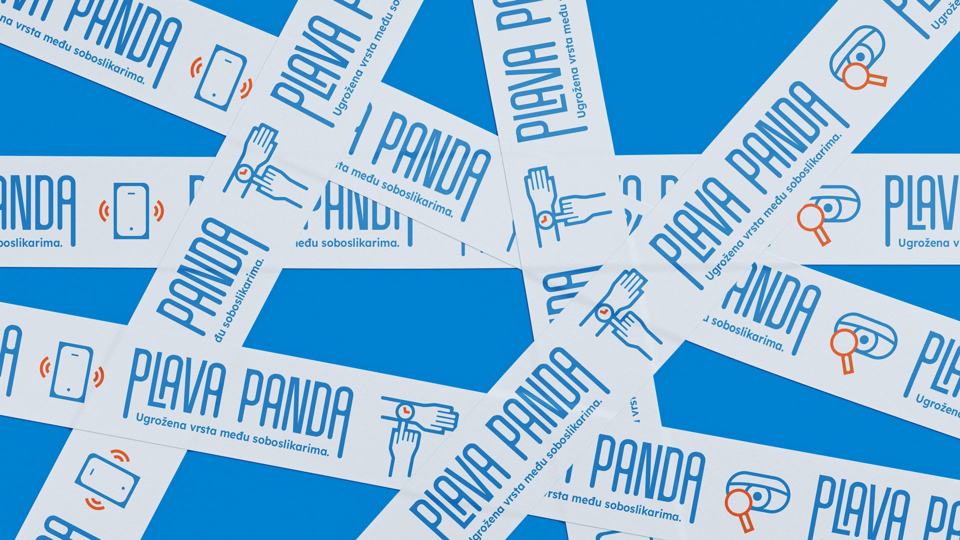
We also created a system of icons that are visually consistent with the logo. Illustrating usual situations between client and worker, they additionally communicate the brand’s message.
 A handyman who you trust. | A handyman who keeps an eye on every detail. | A handyman who comes in on time. | A handyman after who’s work you don’t have to clean up. | A handyman who minds his own business. | A handyman who you’ll recommend to anyone. | A handyman who answers your calls. | A handyman who keeps it straight. | A handyman who cares about environment. | A handyman who protects nature with multiple layers. | A handyman who paints without chemicals.
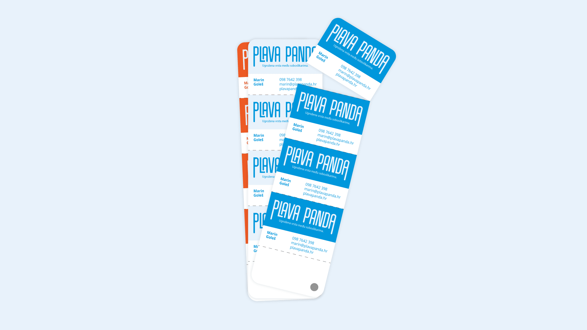
Plava panda strives for functionality and sustainability, so that’s what we emphasized in various materials. Thus, a business card in the style of a tone card becomes a practical part of the inventorty. A branded tape becomes an ad in places where more people are passing by. A stamp pressed on any work material becomes an eco-friendly business card. We also thought about surplus of paint that Plava panda gives away to its clients, together with a brush for small interventions. Check out everything in the rest of the case!

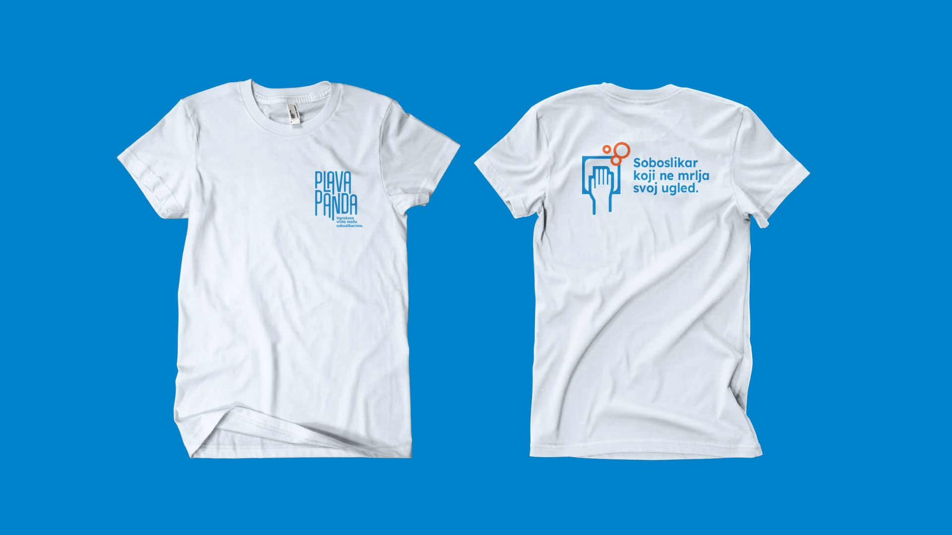 A handyman who doesn’t have a stain on his image.

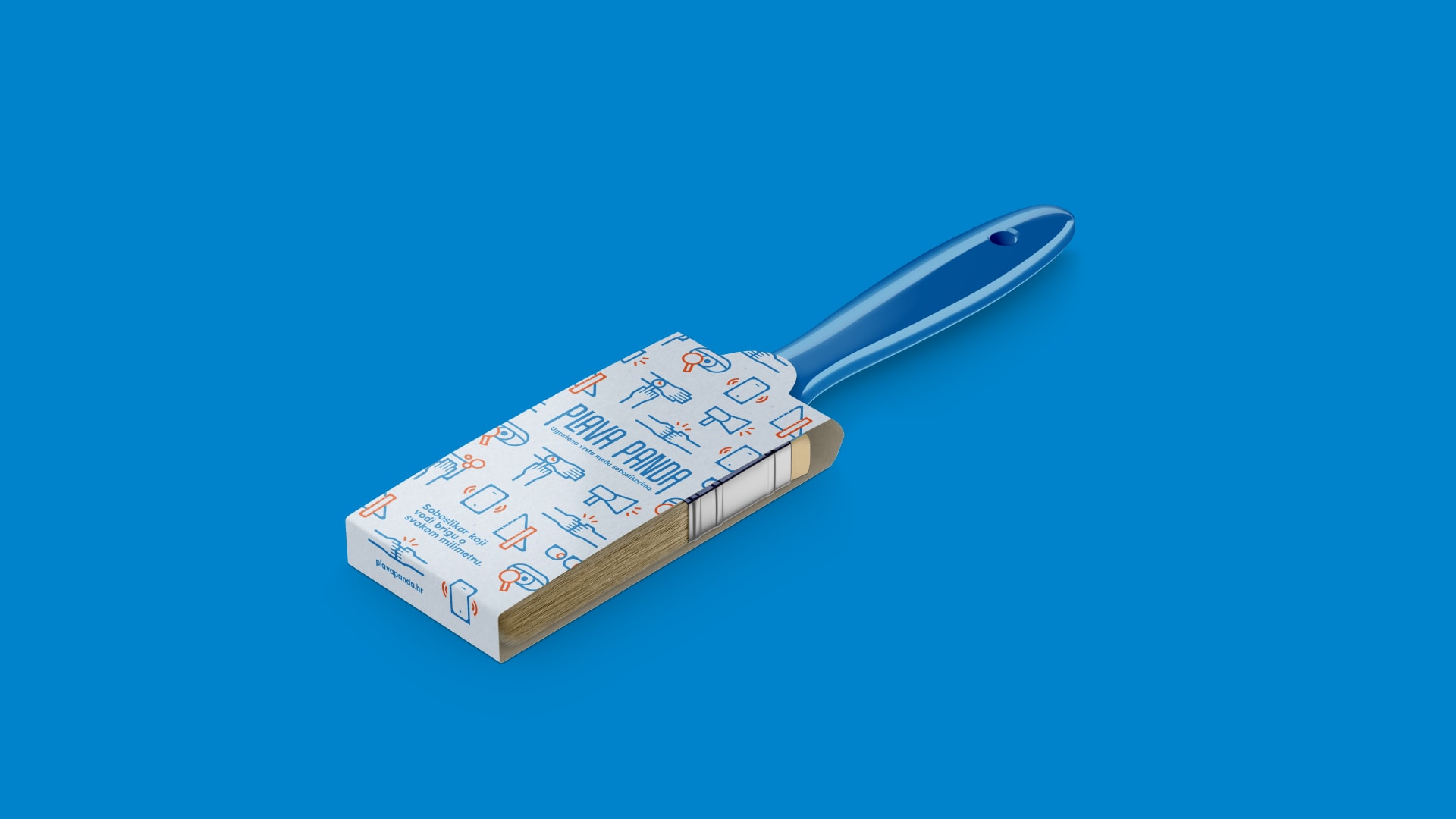 A handyman who takes care of every millimeter.
 A handyman who looks after every little drop.
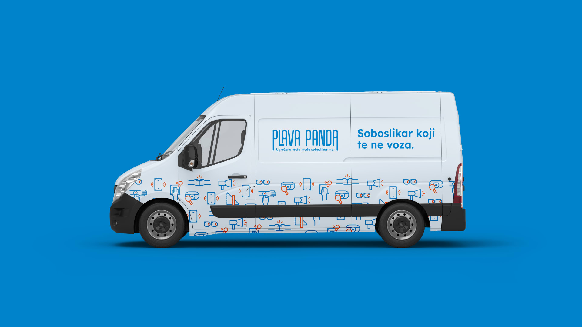 A handyman who doesn’t drive you crazy.

Credits
Señor
Iva Kaligarić ~ Strategic Director | Jurica Ćorluka ~ Head of Creative | Mario Štrok ~ Junior Copywriter | Tomislav Fabijanić ~ Head of Design | Monika Vodopija ~ Junior Designer | Irena Golubiček ~ Head of Account, Branding Specialist | Anamarija Tadić ~ Account Assistant | Nika Novak ~ Account Assistant
Plava panda
Marin Goleš ~ Owner
