Naming a product or company is one of the most frustrating tasks in copywriting. You come up with some great name, you bold it in a Word document, you smile, you can not wait for the checkpoint so that everyone from the agency can see how witty you are... But there you find out that the name is already taken. Everything is taken. You don't even want to think about the horror in which you desperately search for Latin words to save you.
APEX PREDATOR
In the category of classified ads in Croatia there is one enormously large player while everyone else is taking crumbs from the table. Decades of good business and communication have led to the fact that Njuškalo is now practically synonym for the category - its name is in the same rank with Kalodont, Labello or Tupperware. On the other hand, such a good market posititon lulled them and a chance for a challenger appeared in the area of product quality. But we know very well that there's nothing without a good branding.
How to set up a brand that will successfully fight with such a rival, as well as with big international players?
CALL ME BY MY NAME
Advertisers have the widest possible target group which is literally everybody. Some are looking for an apartment, others are selling a car, some have an attic full of their grandmother's furniture, others want to get rid of their old cell phone... No matter how different they are, what unites them is the desire to do their "job" on the classifieds quickly, easily and safely - and of course successfully.
The name of this brand must not only leave the impression mentioned above but it also has to work in other markets in the region and beyond. That is why names that have palatals were discarded immediately - they are difficult to pronounce or have a meaning that cannot be transferred to other languages.
We decided on Dealio - a word that means "we have a deal" in slang, a word that is used in several languages and is known to the communication target group (which is still a bit more narrower than this "everybody" group) that is millennials.
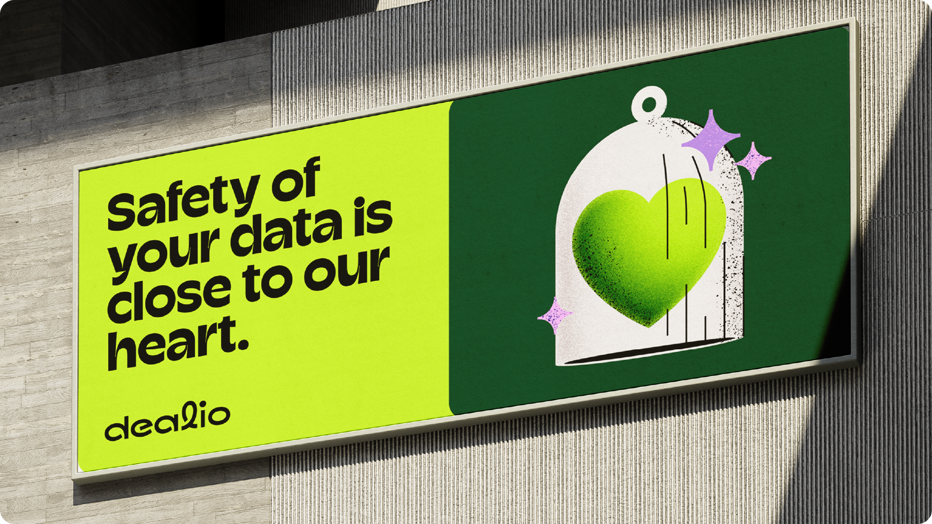
Dealio means that you will reach an agreement faster, easier and safer with a buyer, seller, renter, landlord or anyone else who uses Dealio.
Hold on! There's just a tiny bit of a text left and then you'll see the pictures of what it all looks like. Dealio?
DESIGN? HERE'S THE DEALIO...
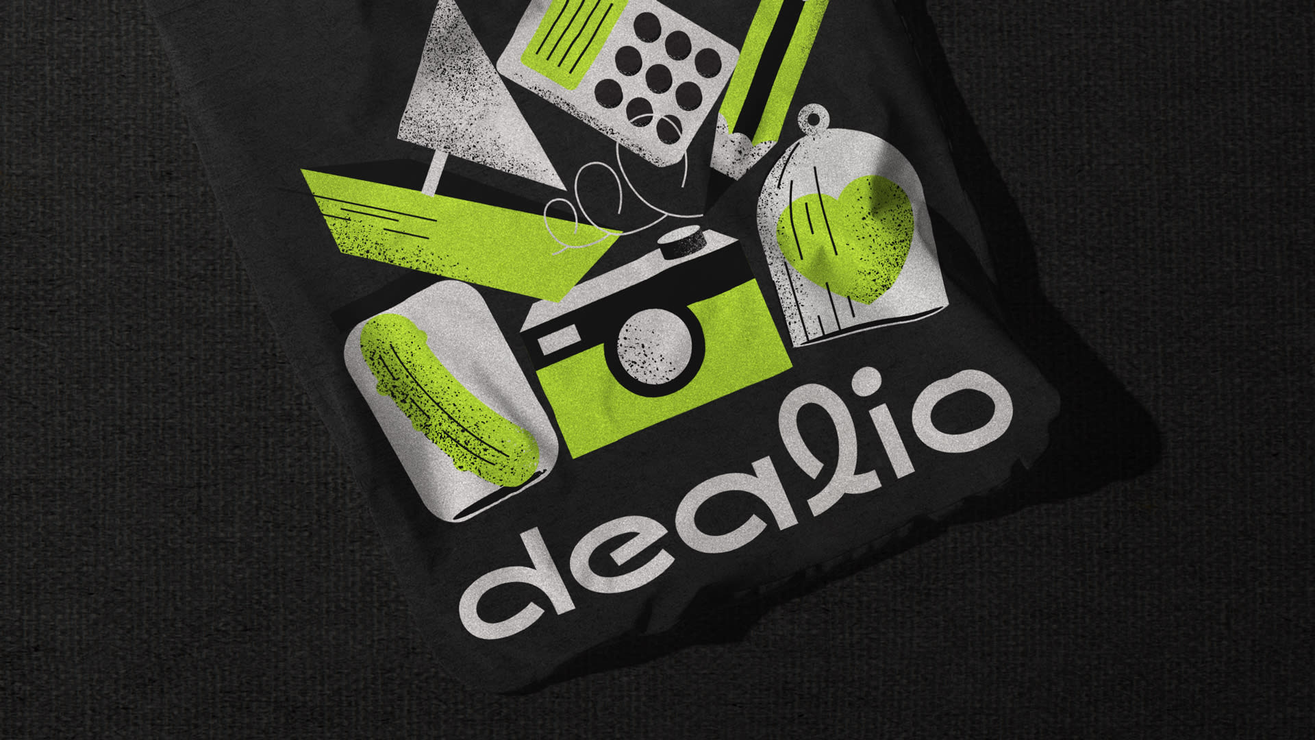
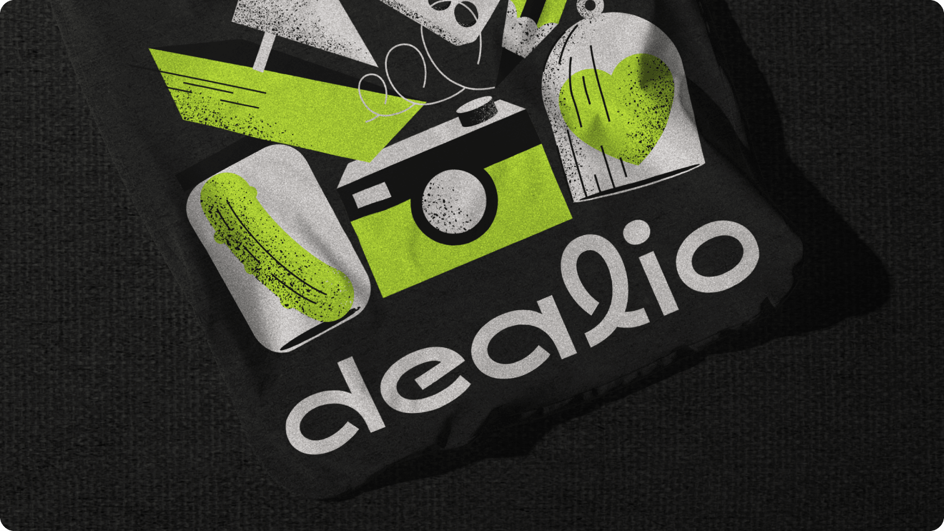
Since you'll be able to find everything you want through Dealio, it will be your connection to everything. And there's one thing that fairly represents connection, contact, bond... Telephone cord! We drew a characteristic stroke from that shape and used it first when creating the logo then later as a light motif in the design of other elements - both for decorative brand elements most often visible on backgrounds and for the construction of iconography and illustration.
The brand colors differentiate Dealio from the competition and together with the typography of the title they contribute to the character of the brand, which is optimistic, accessible and modern.



Credits
Señor
Iva Kaligarić ~ Strategic Director | Jurica Ćorluka ~ Head of Creative, Copywriter | Tomislav Fabijanić ~ Head of Design | Irena Golubiček ~ Head of Account, Branding Manager
Associates
Neva Zidić ~ consultancy in logo typography
Digital Marketplaces
Goran Rubčić ~ Co-founder & CEO | Sanda Soptija Šiljak ~ Marketing Consultant
