Alongside medical products, pharmacy shelves are filled with numerous dietary supplements. As the challenges of modern living increase, the number of pharmaceutical innovations grows exponentially. How do you channel over thirty years of client experience into a consistent line of products that differentiates itself enough to compete strongly with established brands?
Supplement your reading with a few more minutes to read the text below, and you’ll find out.
WHAT SHOULD SUPPLEMENT YOUR DIETARY SUPPLEMENTS?
Nutripharm is a line of premium medical products and dietary supplements launched by Milsing, a recognised regional authority in the aforementioned category. The typical Nutripharm consumer is a woman in her most active years—caring for three generations of her family, at the peak of her career, all while trying to maintain a healthy and high-quality lifestyle. Our goal was to set up and rebrand a line that is experiencing rapid growth, continuously adapting to the customer’s fast-paced lifestyle, and offering top-tier solutions to the challenges of modern living. Whether it’s another hike up Sljeme (without the gondola!), a concert starting at 11 PM with a warm-up act, or a walk in the park with an ever-heavier child on your shoulders, Nutripharm is here to help you seize more moments that drive you, fulfil you, and make you happy.
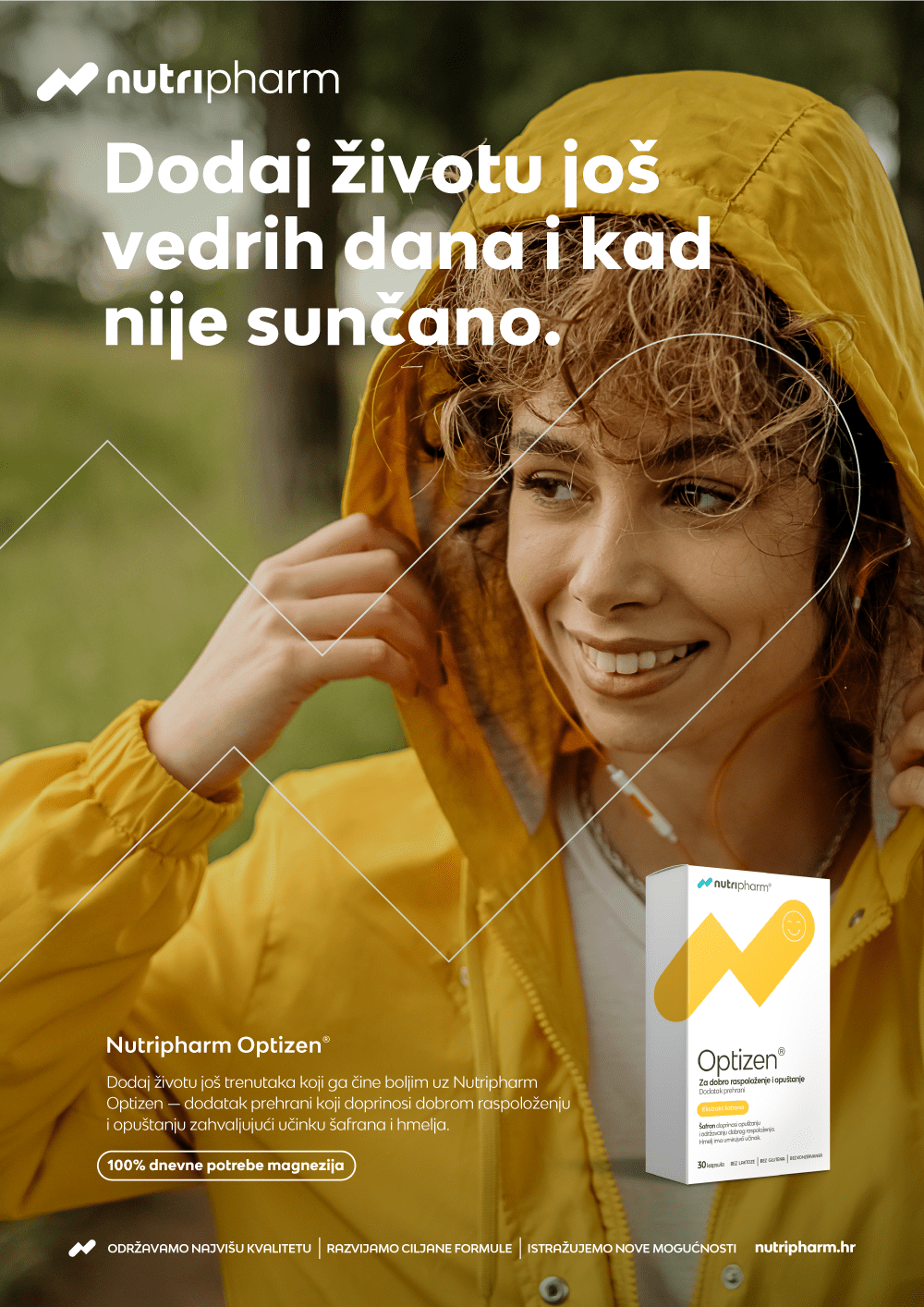
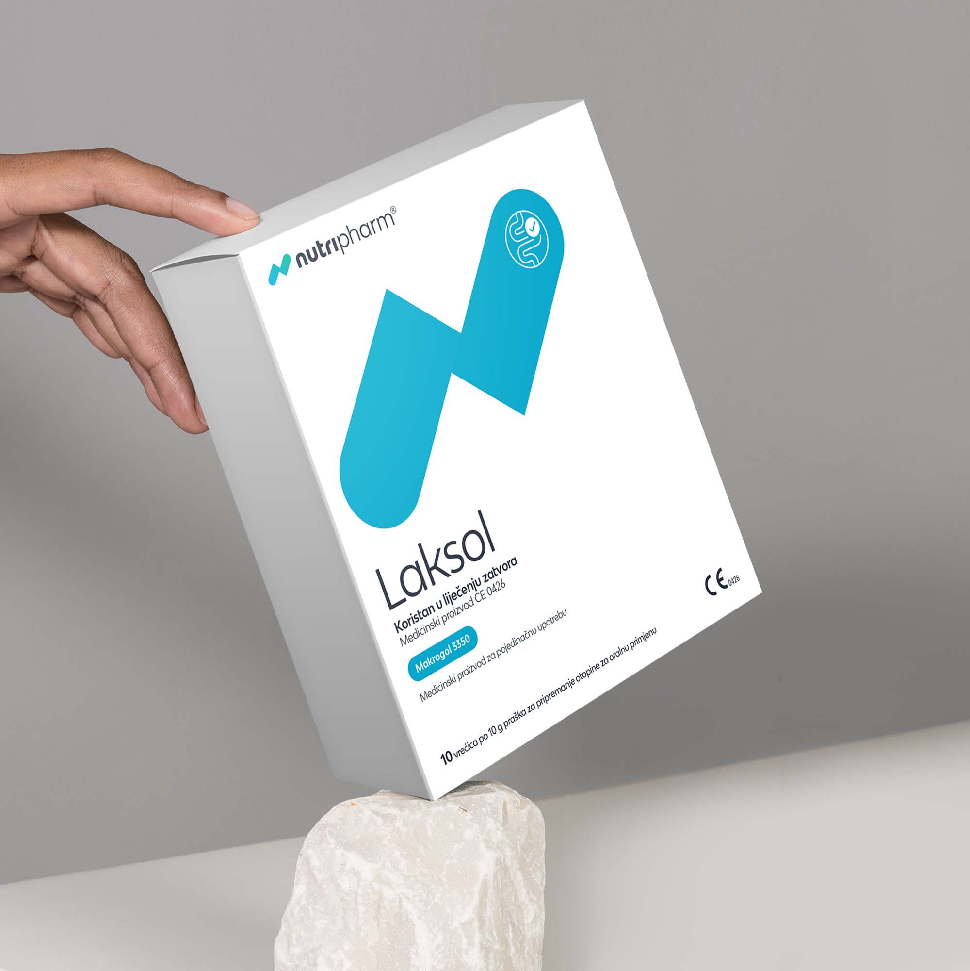
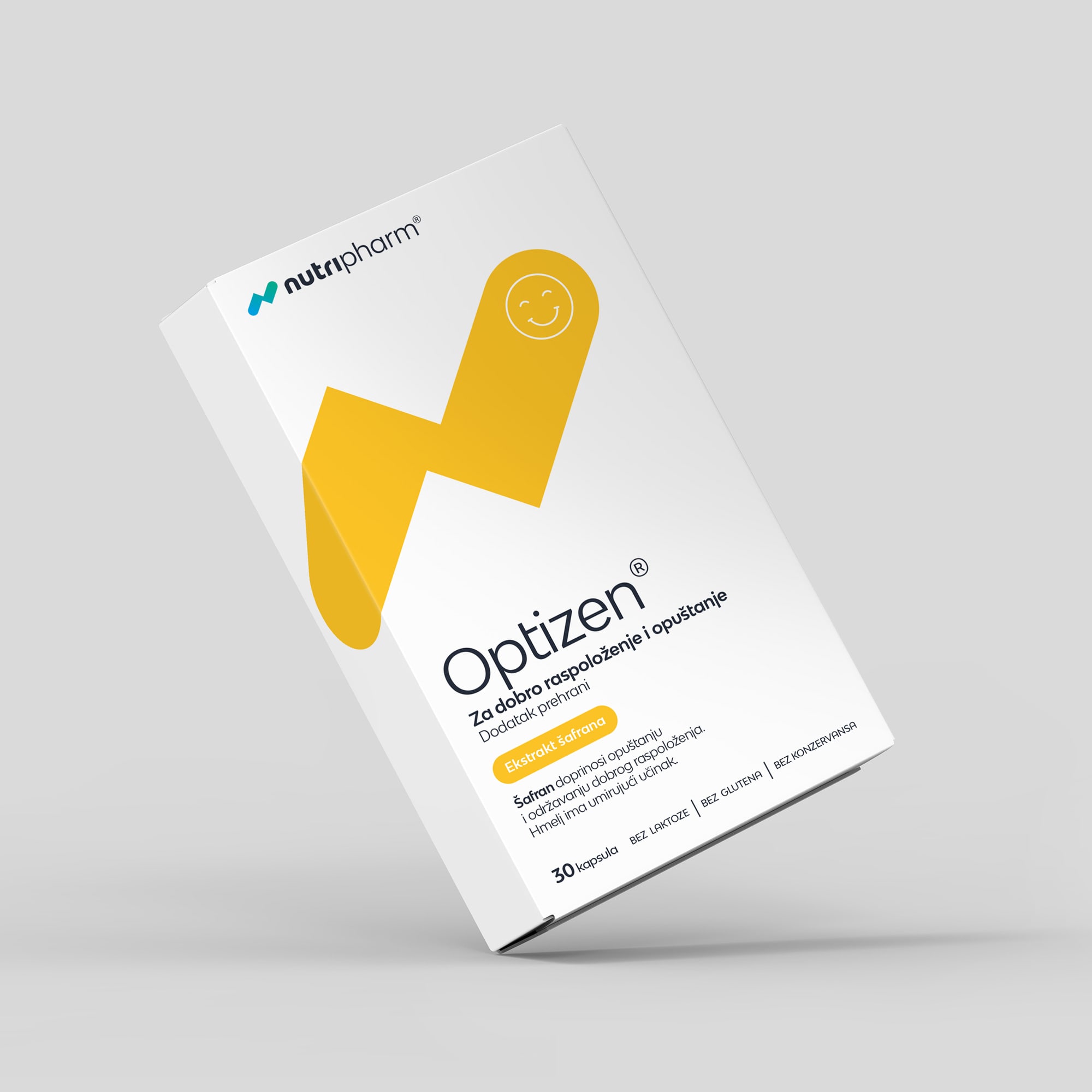
This overarching communication strategy also extends to individual products within the line. For instance, Nutripharm Artriflex helps you run more laps around your neighbourhood, Nutripharm Optizen brings more bright and sunny days to your life, while Nutripharm Laksol offers much-needed relief.
COST EFFECTIVE COMMUNICATION STRATEGY
Our clients’ most important investment is the one they make for their health. That means that their budget is primarily focused on product development rather than costly television production. The creative platform was designed to respond swiftly and cost-effectively to our clients’ constant flow of innovation, market fluctuations, and competitors’ untimely actions. We’ve introduced an entirely new approach to representing health issues (goodbye to the infamous pulsating red dot) and addressing customer demands. By adopting an editing technique of “adding extra” scenes, we aimed to highlight the brand’s core idea: to enrich our lives with a lot more moments that make us happy.


A NEW FACE ON THE SHELF
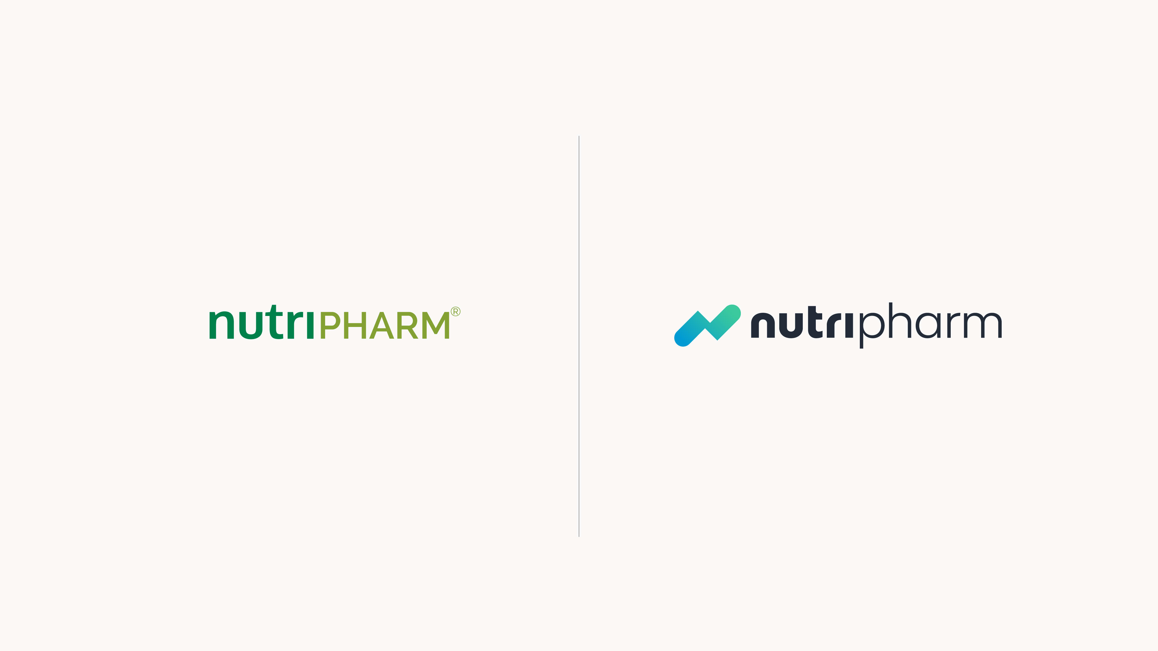
Although Nutripharm has been on the market since 2005 and boasts hero products that are number one in their category, the Nutripharm brand itself is not as widely recognised . This is partly due to a lack of a consistent and distinctive visual identity compared to competitors, particularly in an industry where product packaging is often very colourful and cluttered with elements. Nutripharm’s products are exclusively available in pharmacies, where they often blend in with other products when viewed from a distance. To enhancethe brand’s visibility, consolidate and simplify the line’s appearance, we have developed a streamlined visual identity dominated by the letter “N” in the new Nutripharm logo.
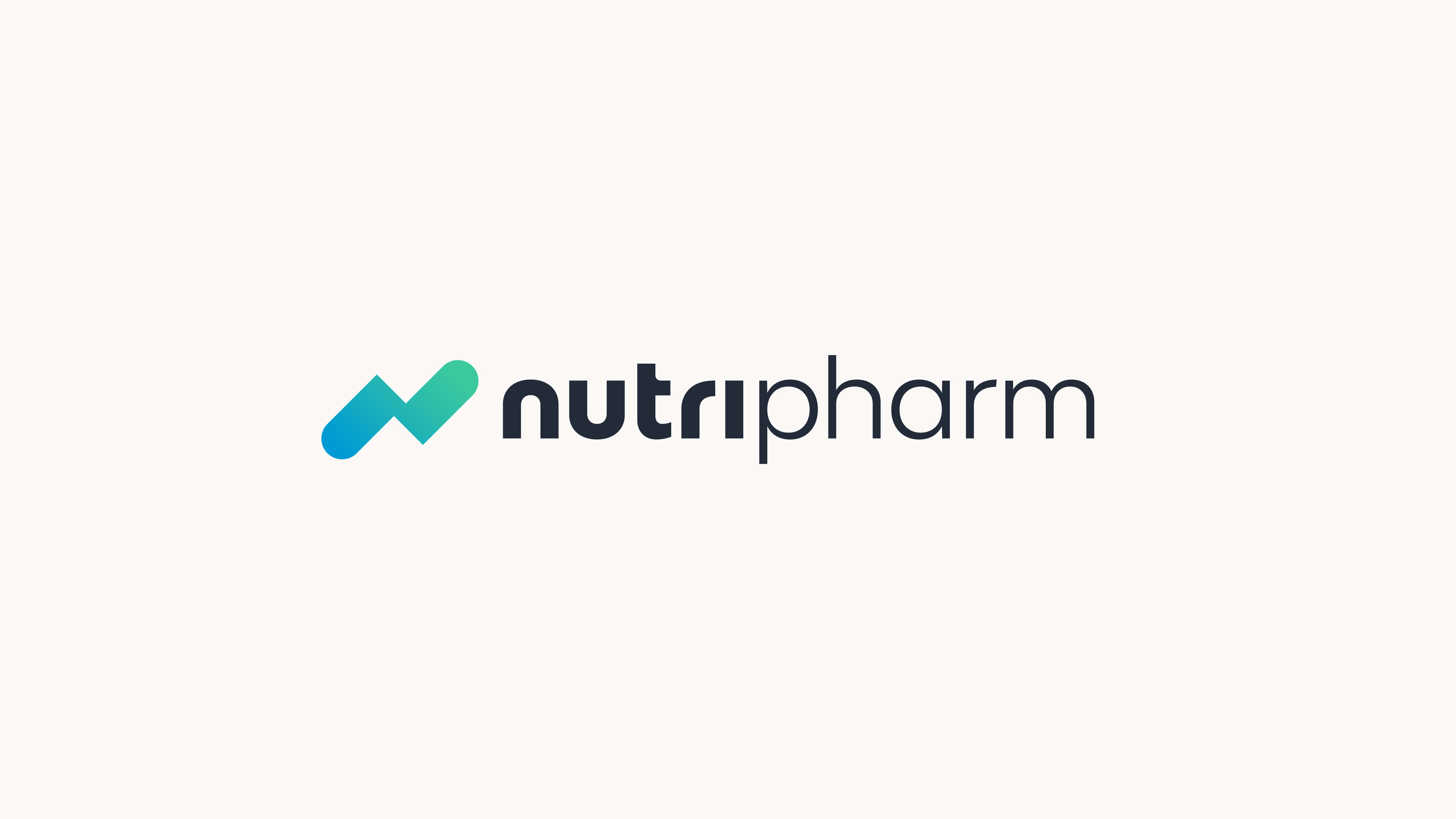
Inspired by laboratory work, innovations, a proactive approach to product development, and the active lifestyle of its consumers, the letter “N” features a beautiful gradient. This symbolises a symbiotic relationship between nature and modern technology, conveying a clear message. Therefore, there is no need for additional wording.

The packaging design system provides an elegant and easy way to introduce new sizes and types of packaging, while preserving the clarity of conveyed information and maintaining brand consistency. The whiteness of the packaging, the dominant-coloured symbol, and consistently positioned elements on the box greatly improve brand recognition even when viewed from a distance, while also helping pharmacists and customers to find and use the products.

Credits
Señor
Iva Kaligarić ~ Strategic Director | Irena Golubiček ~ Branding Specialist | Jurica Ćorluka ~ Head of Creative | Tomislav Fabijanić ~ Head of Design | Marija Lončar ~ Art Director | Mišel Kovačić ~ Designer | Dragiša Mioč ~ Designer | Monika Vodopija ~ Junior Designer | Lucija Drača ~ Copywriter | Vanja Luetić ~ Creative Director | Janja Pilić ~ Account Executive | Anamarija Tadić ~ Account Assistant
Nutripharm
Maja Vukorep ~ Director of Marketing | Morana Matić ~ Marketing Specialist | Marina Keleković ~ Assistant Marketing Director